Because it's Valentine's Day: Le Meurice

Feb 14, 2015

I've been eyeing this hotel in Paris for a bit now despite absolutely no plans to visit any time soon. I figured Valentine's Day is a perfect time to share a romantic, beautiful hotel in Paris. Get ready for some major eye candy!

Hôtel Le Meurice - Paris, France http://www.dorchestercollection.com/en/paris/le-meurice


Hotel Le Meurice, Paris


Le Meurice by MissPandora


With a view of the Garden Tuileries

View of Le Meurice's Facade from the Tuileries Garden, Paris


Or Eiffel Tower

via Inspired Design #lemeurice


Spend the day at the spa.

Spa Valmont at the Le Meurice in Paris, one of the world's best spas


Or having afternoon tea

Milla’s Paris: Dali Afternoon Tea at Le Meurice


Even the doors to your suite are beautiful.

Beautiful Interiors and 18th Century Style: "Le Meurice"


Wishful suite

The Presidential Apartment at Le Meurice Paris. What's not to love?!  Review of this grand hotel at http://www.parisinsidersguide.com/paris-five-star-hotels.html


Hotel Le Meurice. Paris, France. Look this up on google.com , it is stunning. and they treat you SO well! like a princess!


Valentine's Day or not

Champagne at Hotel LeMeurice, Paris.


Get Ready in Style

Bathroom, Le Meurice Hotel, #Paris by Travel Intelligence, via Flickr

On to dinner

Le Meurice Hotel, Paris


Le Meurice Paris. Luxury 5 Star Hotel Paris – Le Meurice™ “The Hotel of Kings” is a Top Award Winning Hotel Opposite Louvre in Paris.


After Dinner Drink

Le Meurice Paris désigned by Philippe starck


Bar 288 at Le Meurice Hotel, Paris France


Or go to the wine room

The wine cellar in the restaurant of Le Meurice Hotel, Paris France


Who has stayed here?

Life of luxury: The City actress Olivia Palermo and her boyfriend of four years, German model Johannes Huebl, fool around in their sumptuous hotel suite at Le Meurice in Paris


Audrey Hepburn photographed with Cary Grant at a cocktail party held at Le Meurice Hotel in Paris (France)


How to fill your days

Olivia Palermo photoshoot with boyfriend Johannes Huebel at Le Meurice hotel for Lifestyle Mirror. Olivia Palermo red Floral dress in hotel ...


And your nights

Le Meurice™ “The Hotel of Kings” is a Top Award Winning Hotel Opposite Louvre in Central Paris


Are you ready to book your flight? Me, too!


Happy Valentine's Day!

Kitchen Trends: Rustic Elegance

Feb 10, 2015

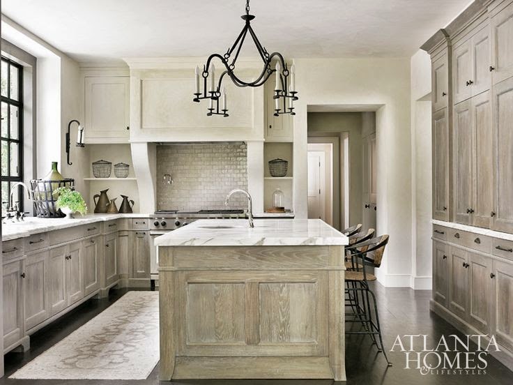
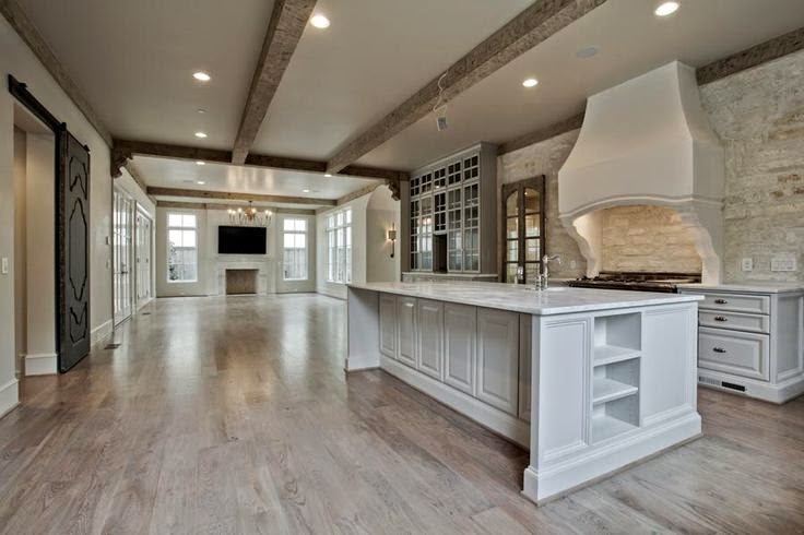
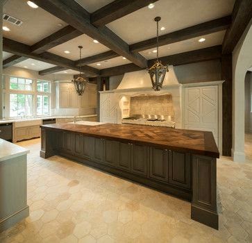
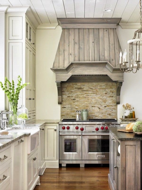
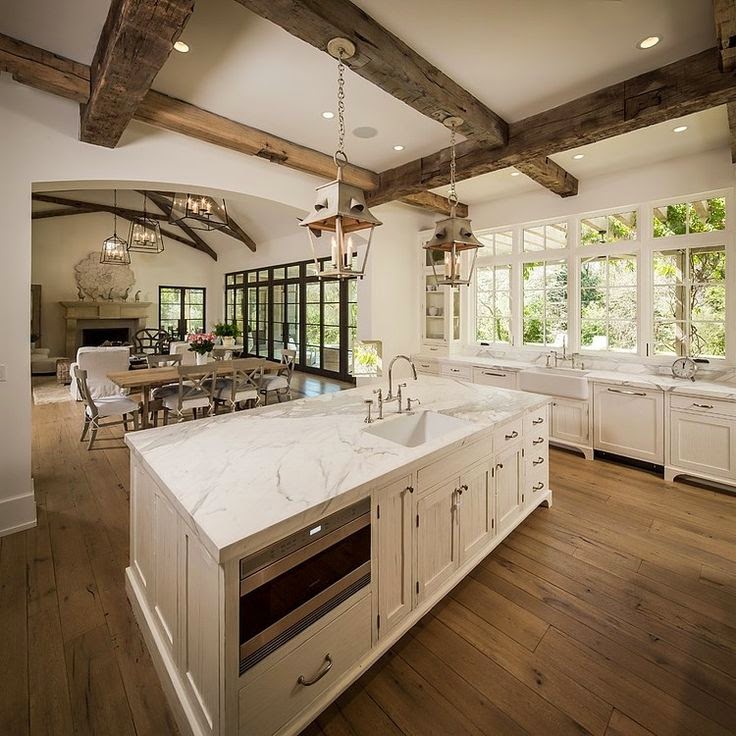
I love a classic white kitchen, but I noticed a trend toward neutral colors like taupe and gray a few years ago. Now, I'm seeing natural woods in lighter finishes in either cabinetry or ceiling beams, too. I'm happy to see kitchens that are still light and bright, but a bit warmer.

This is one of my favorites. I love the gray wood that is balanced by light walls and counters. The subway tile is an updated version of the classic white we are so used to seeing. It gives this room just the right amount of sparkle.

https://www.pinterest.com/jennifercsh/kitchens/


https://www.pinterest.com/jennifercsh/kitchens/


https://www.pinterest.com/jennifercsh/kitchens/


https://www.pinterest.com/jennifercsh/kitchens/


https://www.pinterest.com/jennifercsh/kitchens/


https://www.pinterest.com/jennifercsh/kitchens/


https://www.pinterest.com/jennifercsh/kitchens/


I am completely in love with this herringbone backsplash.

https://www.pinterest.com/jennifercsh/kitchens/


This kitchen is still classic and white. The beams give it just enough warmth.

https://www.pinterest.com/jennifercsh/kitchens/
 
 
The styles of these kitchens are all so different, but every one of them are warm and inviting. I still love a good classic white kitchen, but I have added warmer wood tones through my decor the past year.


It's an easy way to switch things up without a full kitchen remodel. What do you think of these warmer toned kitchens?


My First House

Feb 6, 2015

It's funny how I fondly remember our first house that we affectionately call "the old green house" in our family. When I look back at pictures I get a good laugh at my first attempts at decorating, but I'm not going to by too hard on myself because it was 1999. I don't think there was anything good going on then! I also remember disliking the same things then that I would change today. The difference is back then I was scared to DIY anything, and now I'll attack anything that doesn't look right with a drill or paint brush.

My husband and I moved back to Houston from Orlando about a year after he finished school. Our first thought was to move into the city since we were young and didn't have any kids, but we both found jobs in the suburbs near where our parents lived. We thought we'd rent an apartment for a year and then eventually buy a house, but I noticed a cute Victorian for sale five houses down from my parents.


I made an appointment to look at it and was horrified by the inside. All of the woodwork was golden oak. The walls were painted peach. The flooring was probably the worst. It had a psychedelic 70s tile in the entry and shag carpet that was probably 20 years old...and the owners had pets. I could see the potential, but knew it would cost a fortune to fix up. We looked around at other houses in our price range and were even more disappointed. We considered moving into an apartment, but I kept thinking about how great the Victorian could be so we ended up buying it.

In this picture we had already trimmed the oak tree so you could actually see the house, landscaped the yard, replaced the mailbox, and added a white picket fence to the side. I had eventually planned on replacing the front porch, removing the starburst from the garage window, and painting the house yellow. We never got that far before moving, but we definitely left it in better condition than when we bought it!

The front door was a scratched up mess from the previous owner's dogs. I can't tell you how many times I put scratch cover over it, as well as all the woodwork on the inside. Don't you love the lacy curtains? You would think an 80 year old lady lives here!


And, the railing in the entry! It separates the entry from the dining room and was seriously the single thing I hated most about this house. I used to walk by and kick it sometimes. I would have no problem taking a sledgehammer to it now. :)

FYI-You're going to see a lot of family pics in this post. I rarely took pictures of my house without people in it...for good reason.

It really wasn't all bad. I loved the woodwork around the doors and windows.


Don't judge the mom jeans!

The best part of the house was definitely the breakfast room. Those blue and green stained glass windows sold me. The beadboard was real wood and unlike anything I've ever seen. The cabinets also had beadboard fronts and were custom made. You don't see that in many homes these days. This was my spot to drink coffee and read home magazines. My mom would walk down the street and join me most weekends.


This is probably one of the only times you will see angled furniture in my house. It's such a pet peeve of mine. I think I only had it this way for a week or two before I moved the sofa back against the wall across from the windows.

Once my son came along and started solids I turned this back into a breakfast room. The dining room had new carpet, which was not a good place to feed a baby peas. It was a tight fit with this big World Market table, but I fell in love with it and decided I would make it work. A close friend of mine has this table in her kitchen now. It's holding up great 12 years later. You can see I replaced the metal blinds with 2" wood blinds and the vinyl floor was replaced with new tile.


I also decorated my first nursery in this house. I went with white furniture and yellow walls so it would be gender neutral if I had a girl next. I should have just decorated for a boy because that's all I ever ended up having!


Someone in our family gave us this hutch and I repainted it, added beadboard to the back, and replaced the knobs. I can't say I ever liked it, but it was free.


We did spend a lot of money on this house in places you don't see. We realized after the first big thunderstorm we had a massive drainage issue in the backyard. Water was almost coming in the back door because the yard slopes towards the house. Thanks, home inspector. We added French drains to solve that problem and put in an extended stone patio so we could finally enjoy the backyard. Don't be jealous of my plastic furniture. There wasn't much of a budget after paying for the repairs and patio.
 

This house holds so many good memories of our oldest son. We moved when he was 16 months old, but we got to experience so many of his firsts here.

He fell asleep before the first trick-or-treater, but it's the costume that counts.


My little big turkey at Thanksgiving.


First Christmas...with a broken tree. On Christmas Eve I woke up to my brother and husband dying laughing. My brother tripped and fell on the tree. My husband said it reminded him of when Will Ferrell jumped on the Christmas tree in the movie Elf. They drove around trying to find a tree lot open to replace it, but of course they were all closed on Christmas Eve. We just held the tree up while taking pictures next to it on Christmas Day. I obviously forgot about it in this picture, which I am now thankful for lol.


My oldest son's first birthday. He obviously thinned out when he started walking!


I can't believe he's 12 now!

If I could do anything different, I would go with my first instinct when walking through the house for the first time. I would put in wood floors and paint all of that scratched woodwork white. It goes without saying my décor choices would be completely different, but I can't say they are all that bad given the era and budget constraints. Whether it's home decor or clothing, go timeless. Your future self will thank you. There's a reason you only see two pictures of me in this post. Denim overalls is all I have to say about that!

This post was inspired by the real estate guide, Compass. It's a great resource if you are looking to rent, buy, or find an agent in the NYC or DC area. Check out their neighborhood guide for in-depth and current information here. I particularly enjoyed reading about Chelsea since I have family that recently moved there. Now, I can't wait to go visit!


No Sew French Pleated Drapes

Jan 29, 2015

I love the look of pleated drapes with their pretty tailoring and perfect folds. Because I don't want to pay for custom drapes I've tried to fake a pleat by pinching the fabric from behind and securing it with a clip. It was better, but it still wasn't quite right. I was frustrated with my messy ready made drapes and just took them down for a while in a few rooms. I decided to check out the pleating tape at the fabric store a few weeks ago to see if I could figure out how to DIY them without having to take a sewing class. I immediately realized after seeing the tape it did not have to be sewn on the drape. I have no idea why it didn't occur to me before, but it can easily be applied to the top of a ready made curtain with fabric tape. Stitch Witchery and Heat n' Bond are common brands. I've used both on fabric projects before and they work great. This one is no exception!

Here are the ZGallerie drapes you may have seen in my bedroom, now triple pleated. I just love the way they hang so nicely now.


I can't wait to show you all the changes I've made in here recently!

The only downside to pleating the drapes is they are a couple of inches too short now, but lowering the rod will solve that problem. I like my drapes to just touch the floor.


Here is how I did it and what I used.

Pleating Tape


I bought mine off Amazon since the one at the fabric store could only be bought by the yard and I had no idea how much I needed. I decided to check Amazon and it was a great deal for an entire roll.

When you lay it out at the top of the drape, the single yellow line goes at the top and the double yellow line goes at the bottom. The vertical white lines are the pockets for the drapery hooks. I don't have them pictured, but you can find them online or in the store. Mine are four pronged with the exception of the single prongs you use at each end of the drape.


Fabric tape


I've bought this everywhere. Walmart, Target, Amazon, and Joann's all has it for just a few dollars a roll. I used less than a roll for two drapes.

I only had a regular hold tape so I decided to use three rows of tape to make sure it would hold.


You'll want to lay out your pleating tape so the pockets at the ends are at equal distance from the edges before you cut it to fit the drape.

Then iron the pleating tape with the bonding tape underneath until it sticks together.


Now, you're ready for the prongs. The single prongs go on the first pocket at each end of the drape. The four prongs can go in the next pocket. After that, I chose to skip two pockets between each prong.

Single prong at the end of the drape


You can see the two pockets I skipped between prongs in this picture.


I attached the round clips I already had to each prong to hang them on the rod.


And, here are both of them finished. I have these pushed further to the sides in this picture. My husband spent too much time and energy on that wood trim to cover it up.


A closer look. They might be a bit wrinkled from being pushed together.


Besides, being very inexpensive it's just a cut and iron project. It took approximately 30 minutes to finish two drapes. The best part is I didn't have to pay an exorbitant price for custom made drapes. You might have noticed I've moved on to my dining room drapes (the gray silk ones pictured above). I'll never have messy drapes again!


http://thriftydecorchick.blogspot.com/2015/02/february-2015-before-and-after.html?showComment=1422907636526#c3149944820418656297


http://www.worthingcourtblog.com/2015/02/scoop-link-party-156.html?utm_source=feedburner&utm_medium=feed&utm_campaign=Feed%3A+worthingcourtblog+%28Worthing+Court%29