Showing posts with label New house. Show all posts

Cool Pools: Inspiration for Our New Pool

May 28, 2015

I've been trying to write this post for a week now! It's as much for my potential pool builders as it is for you. We're coming down to the wire on having to submit a pool design to our homebuilder and I'm not any closer now than I was a month ago, but it's okay because I have two potential designs in my head. Between my son stealing my computer to play cool math games, work and too much fun on the weekends (I won't lie!), I've been slacking a bit on everything else. My husband just shoved a pad of paper and pencil in front of me today and said to get this pool design done. I've got to work on it before he comes up with his own design, probably a grotto pool worthy of a Hugh Hefner party and a slide coming down from the second story of the house. Yes, he's more fun than I am.

We built our current pool a little over three years ago and while it's a process, it's so worth it to get exactly what we want. There are so many decisions to take into consideration and I'm happy to make each one. I love the waterfall with the moss rocks and freeform design we currently have, but I'm looking to do something completely different in the new house.


Unfortunately, I have not been able to find a picture of a pool that fits the picture in my head. I have been able to find certain elements I like in different inspiration pictures. The first thing I have to consider is the style of our new home. It's a traditional brown stone and brick, but it has a bit of European influence because of the roof line.


One of the regrets I have about not getting the stucco and stone exterior is that I passed up an opportunity to incorporate the tropical look I love so much. But, when I was searching for a vacation rental recently in Alys Beach/Rosemary Beach, FL I realized a lot of their homes (and pools) have a European flair. Hmmm...I could do a little traditional, a little contemporary (because too much traditional is stifling to me), and a little bit of Old World style ala Alys Beach. That's a lot to take in when I describe it. I'll just show you in pictures.


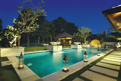
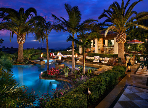
What's not to love about this pool? I know you're probably thinking how am I going to incorporate this look into my suburban backyard. It's the rectangular shape and the Old World fountain that I want to take away from this design. I really do love it all, too. Maybe I can vacation there if I book at least 6 months in advance. If you follow my Instagram you know what I mean!

But, I also like the bowls on pedestals as a waterfall option.


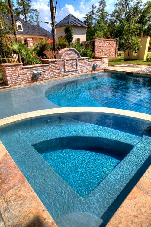
And, while I like the simple rectangular shape of these pools I also love this more formal design for the hot tub and sun shelf. 


I can't decide if this is too fussy for my taste even though it's beautiful.

The waterfall has to come off a wall of some sort. I toyed with the idea of a cream colored stucco wall for more Old World style and a way to make a few palm trees work. It will probably get too wet for stucco and be a pain to maintain. There are stucco-like options that I'm looking into or I could just go with a cream colored smooth tile. I think I'm pretty much sold on an arched wall regardless of the finish I choose.

La Dolce Vita: July 2009


This one has a brick arched wall that's pretty, but there is so much brick on the new house I will go for a different material.
 
 
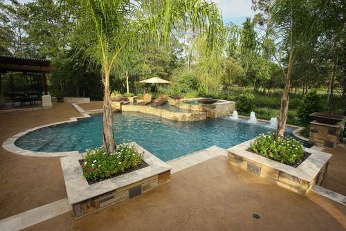
Another look I like is large planters partly built into the pool.  It softens the edges of the pool and keeps it from looking so flat.


Isn't this pool just amazing?
 
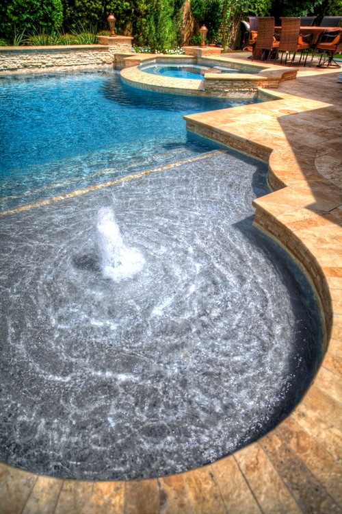
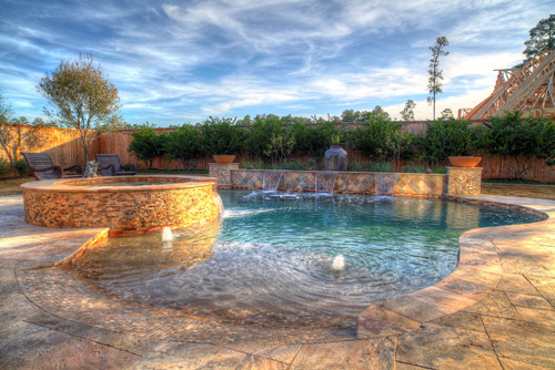
And, the last item on my wish list is a beach entry.
 
 
The mosaic tile on the edge of the beach entry is just amazing!
 
I'm glad I was able to find pictures of what I have been dreaming up in my head even if it's a combination of many pictures. Once I get a drawing back with the winning design I will definitely share it with you!


New Home Selections

May 12, 2015

The most exciting part of the entire building process is choosing the finishes. I had a very good idea of what I wanted before I stepped in the design center after looking at other homes the builder had for sale and other communities models. I might have been a bit of a home stalker, but it completely paid off in the end.
 
Let's start in the kitchen! The kitchen is going to have these white cabinets with the glass uppers and that hood. I love, love, love that hood! Mine will have a little different trim on the bottom. The lower cabinets will be white, but the island will be gray.
 
 
I know we've all seen white kitchens with gray islands, but let's take a look at one for kicks.


Here is a sample of the gray island cabinetry. I love that mosaic backsplash sample in the picture, but it was insanely expensive so we decided against it once we got the pricing back. The alternative we chose is a white subway tile with a beveled edge and gray grout. It was still an upgrade, but a quarter of the price of the mosaic tile. The countertop will be carrera marble. I'm a nervous wreck that I'm going to destroy it, but after seeing it in another house I just had to have it. I was absolutely giddy when I first laid eyes on it and by my husband's expression I probably looked a little crazy. I should have told him it would be like his reaction to top of the line golf clubs. He would have understood!


The next big decision was the master bathroom. I was so excited to find a porcelain tile that looks exactly like the marble countertop sample. The tile will be a rectangular 12x24 size instead of the square in the picture. It will be on the floor and the walls of the shower. The hard part was choosing a grout color. I immediately thought I would want white, but it looks too white against the tile. I ended up choosing gray grout. I never imagined grout colors would be my Achilles heel in this entire process. I am not thrilled about the mosaic tile below for the tub surround, but it's such a small area that I didn't want to spend a fortune on more marble. You would think because it's such a small area it wouldn't be inexpensive. Nope!


Here is a close up of the gray and white grout samples next to the tile. The white looks fine in the picture, but it really is much brighter in person compared to the tile.


Pretty inspiration picture


I'm considering painting the walls a dark gray if we have enough natural light to offset all the white.


The cabinets will be white and the countertops are going to be marble. The guest bathroom and powder room are also going to have the finishes as the master bathroom. Yes, more marble!

On to the boys bathrooms. There will be no marble in here! All three boys will have their own bathroom and I decided to go with the same finishes in each one. It's easy and there will be no fights over who has the best bathroom.


The cabinets will be white to offset the slate gray floor and dark gray granite counters. I chose an inexpensive standard tile for the shower since the shower curtain will cover it anyway. I can make each bathroom a bit different with the wall color and accessories to go with their rooms.

Similar bathroom


These are my favorite lights for above their vanities, but I found so many I like that I might choose a different one for each of their bathrooms.


I made a last minute switch at my second visit to the design center when it came to the flooring. I had initially chosen an engineered floor after finding out the wood tile I love so much was way out of our price range. I had mentioned I would love stained on site floors to the design consultant and she mentioned the narrower boards were about the same price as the engineered floor. Here are the two floors side by side.


I love the way the real wood floor on the right looks with the gray kitchen island cabinet. I was told the narrower boards would be better with the humidity in our area. The wider boards have a tendency to buckle so I'm feeling a bit better about choosing the 2 1/4".

There are so many other little details we chose that I love as much as the big decisions. The front doors, the fireplace and the beams are details I can't wait to see be installed. We have a while before that happens. It's all sawdust, dirt and rusty nails right now. It's still exciting and it finally looks like a house now. I can't wait to show you the building progress next!


Surprise! We're Building a New House!

Apr 26, 2015

Yes, this is definitely the month for surprises. I mentioned last week that I started a new full-time job working from home in the nursing field, plus I've been working as a stager/design consultant for a while now. Now, here comes the most exciting surprise. We're building a new house!


This honestly took us by surprise, too. It's been harder and harder to deny that our house isn't functioning as well as it once did. I have three boys that are getting bigger by the day. My 12 year old is just a hair shorter than I am! I wouldn't say our house is completely uncomfortable, but I kept wishing for wider hallways and a kitchen/breakfast room that all five us could fit in without bumping into each other. I'll be honest. It's not completely necessary for us to move. I know other families of five, or even more, would be perfectly happy in our home. And, I'm hoping they'll buy it!

My husband and I decided to look around our town for a bigger house with a pool already in. The house also had to be zoned to my older son's school. My two younger kids are still young enough that moving schools wouldn't be an issue. We started with a few open houses. They were all in great neighborhoods with beautiful exteriors. But, then we opened the front doors and realized all of the kitchens, room configurations, and flooring needed to be redone. Add in that they are all at the age where the roof and air conditioners need to be replaced, and I just felt like these people were unloading their money pits. I've been there, done that, and didn't even get a t-shirt...twice.

I was hoping to find a house that had been taken care of like we have taken care of ours. My husband called me one day in December and said there was a home for sale that had been completely updated. He went ahead and made an appointment for us to see it. I didn't even look at it online before seeing it in person. I noticed it was in an area I love driving in. It's close enough to my favorite stores and restaurants that we could walk or bike to them. We could barely get in the neighborhood because of all the kids and parents in the street. Built-in playmates for my kids is a plus! The house was in a cute cul-de-sac with about 25 neighbors gathered for their Friday evening wine and playdate. My husband turned to me and said,"We're moving here!" We looked at the house and it was nice and updated, but not my style and the rooms felt a little small because of the choppy floorplan. We walked outside and the neighbors descended on us to introduce themselves. It was the epitome of suburban charm. I even joked to my husband that I bet the neighbors were paid to be so nice and welcoming. We now call it the Funny Farm house.


If you haven't seen this 80s movie then you need to rent it! My kids loved it. The homeowners are trying to sell their house and pay the townspeople to portray a Norman Rockwell version of an idyllic town. Hence, the Funny Farm house! Here are the townspeople pretending to be perfect neighbors for cash.


We really considered buying this house because of the neighborhood, but we would have had the exact same issues there we have in our current house despite the 1300 extra sqft. The great room was small with low ceilings. The dining room, entryway and kitchen were too small, also. It really did not feel much different than our current house. It's amazing how a layout can make such a difference despite square footage.

At this point we were pretty much defeated. There wasn't anything on the market I even wanted to see in person. I wasn't surprised because I had been keeping an eye out for larger homes on our local real estate website and nothing is ever updated. Well, at least in a style I like.

My husband kept pushing me to look at a community about five miles north of our town with new construction homes. I humored him, but said there was no way I would ever move out of our amazing town with great schools to live out in the middle of nowhere (5 miles lol). Of course, I was blown away by the homes. To add to my dilemma it was December and the amazing specials were going to end at the end of the year. I was also told there would be a price increase in January. What a way to add pressure! We were torn between a few builders, but chose Darling Homes. Initially, we loved Highland Homes because the model was so pretty and modern. After touring the models a few times I realized the Darling home was actually very similar to the Highland plans, but the decorating is what sets them apart. I pride myself on being able to see the bones of a home, but the paint colors and questionable décor in the Darling home really turned me off in the beginning. It took a while to notice everything in the Highland home was also in the Darling home for much cheaper.

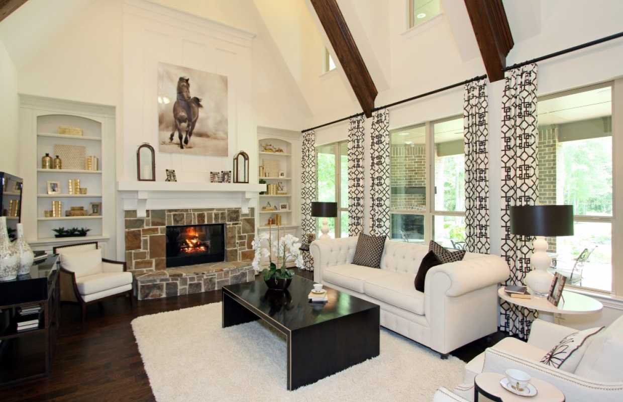
Highland Home
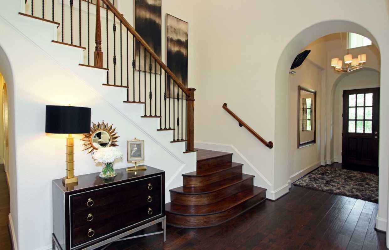
Stairs


Family Room


Family Room


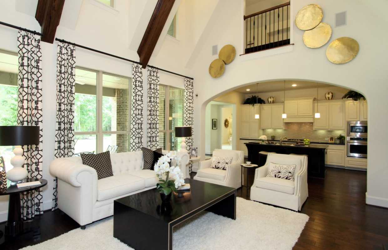
Darling Home

Woodforest Luxury Family


Woodforest Luxury Gameroom

Even though we found a great floor plan for a great price, the lot was equally important. There was a lot someone else had reserved in a new subdivision that we really wanted. It was almost a half acre with no rear neighbors. Who wants neighbors in your rear? I don't! If you want a pool in your backyard it's important to pay close attention to your backyard size and privacy. Knowing my neighbors can look out their window and see me sunbathing in a bikini isn't the best feeling in the world. Anyway, the couple that had reserved the best lot in the neighborhood cancelled so we jumped at the chance to take the lot before someone else did. So, we bought a house! OMG we bought a house!

There is so much to share with you that this will take many posts. The best part is the design choices, of course. Coming soon!