I chose white to contrast with the gray island. It's a prettier, softer look than the black. I considered a more transitional stool, but nothing caught my eye as much as these or went with my traditional kitchen so well. They also go so much better with my living room furniture.
I love the way the look with my current breakfast room too. I am planning on changing up this room as well, but who knows how long that will take?! The first thing that needs to go is that chandelier that was supposed to be temporary. It's honestly driving me crazy! The bistro chairs were from the beach house when I decided I didn't want to decorate with gray there. I might take them back to the beach house to use on the balcony when I find new chairs for this room. They're just a little too casual in comparison to the other rooms in this house.
You might notice I took down the lanterns. They just didn't quite go so we put the plates over the outlets until I pick new lights. Here it is before we took the lanterns down.
Before-It was just too harsh. Maybe if the cabinets had been a cream color or the island painted black they would have gone better.
New Pendant Dilemma-Metal Color/Style
The big question is do I match the lights to the silver hardware or the brass in the adjoining rooms? I'm not a fan of overly brass kitchens and I don't love brass with bright, white kitchens. That's just my personal preference despite seeing the look everywhere these days. There's something a bit harsh about it. However, my island is gray and I love brass with gray. I do love two tone metal kitchens. I would love to have a silver vent hood with brass trim. However, that would be an unnecessary expense. Maybe adding brass lights and keeping my silver hardware would give me that pretty, two tone look. It would also keep the gold tone to a minimum. I love silver tones, but with the French style my home has I feel like it would take on a Hamptons look instead. So I am considering brass pendants and keeping the hardware silver. The second question is pendant style. I am leaning toward a transitional style since everything in the room so traditional. I feel like lighting is one element that can update a traditional room.
Recovering the seats
One thing I didn't mention about the stools is that the seats are linen. I am fully aware these will not last with three kids in the house. The good thing is they are easy to re-cover since there is no welt around the bottom. I took a look at fabric the last time I was in Schumacher's showroom shopping for a client and there are some great performance fabric options.
I'm also considering vinyl that looks like leather. I had a banquette made for a client's pool table room and you would never know it wasn't leather. There are different colors (blue, gray) and even different textures (animal skin). This would be a better option since performance fabric can still stain. It's great for living room fabrics, but I'm not so sure I want to deal with it where food and drinks will be dropping on it often.
Breakfast Room Plan
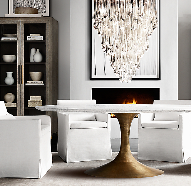
The next step is to plan out the breakfast room and the pendant lights. This is the look (via Restoration Hardware) I have in mind for the breakfast room. That table is amazing! I'm not sure I want a marble top and these white linen chairs look like kryptonite to me. I need a family friendly version of this!

But with this chandelier that's so expensive it makes my eyes water. Even the designer discount doesn't help all that much!

Only if practicality and budget weren't considerations!


No comments:
Post a Comment